
ProArt Color Control
UI/UX Design
Participated in the planning of ProArt Creative Hub and Color Control Tool from a designer's perspective, and proposed functional suggestions, such as the color chips sorting function, optimization of color matching experience, control panel UI hierarchy, and more.
Project Brief
Project Duration
Project Type
Contributor
Sep. 2022- Dec. 2022
UI/UX Design
ASUS Software Center
ASUS Design Center
Software Planner
Yuwei Tsao
Designer
Hsiao-Han Chou
My Contribution
Functional Specification
User Flow
UI Optimization
Project Background
Introduction to ASUS ProArt Creative Hub
ProArt Creator Hub software is a tool designed to help professionals optimize system settings, calibrate colors, monitor performance and quickly access vital apps.
*Only ASUS ProArt Series support this app; supporting devices may vary.
Color Management
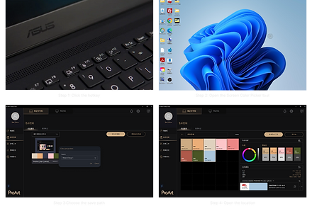
Color Management is a new feature of ProArt Creator Hub that enables users to select any color on their screen using the Screen Color Picker tool and immediately view all the associated color data with the Color Analysis feature. The Color Palette allows them to build their own personalized color preferences. This makes it easier for them to access the colors they need for their projects and allows their creativity to flow more freely. We collaborated with Pantone in 2023 to provide users with access to a wealth of digital color data that help enhance creativity. It is a powerful and essential tool for any professional content creator or artist looking to produce work that is both accurate and creatively inspiring.
Process
Current State Analysis
Business Plan

Design Document

Prototype
RD Prototype
Flow analysis

UI/UX Optimization
UI Flow

Optimization List

-
How I work
I offer various types of design assistance throughout different stages of the project. Initially, I collaborate with the planner to propose business strategies and define specifications. During the execution phase, I partner with designers and software engineers to create prototypes that validate the ideas. Once the software is almost complete, I help identify bugs and areas that need improvement.
Design Outcome
I. Drag and drop to change the order of color chips
ProArt Creator Hub software is a tool that can help manage and organize color palettes. For professional designers, the order of colors undoubtedly affects the ambience of color scheme, so intuitively dragging and rearranging the color chips is a necessary feature.
II. Define the save path of sample colors picked by the Screen Color Picker tool
Future Plan
.png)
Current Solution
Screen Color Picker is a feature exclusive to chip management. The problems with the original prototype were that the storage path was undefined, and it was difficult to communicate the shortcut keys to users. The current solution is temporarily not supporting the function with any shortcut key. A future optimized version will support keyboard shortcuts on specific models, allowing users to activate the Screen Color Picker tool. After picking a color, users can select a storage path.
III. Improve color matching experience by removing the drop shadow effect of the second palette
The second panel can be used for color matching during the design process. This feature can offer the creators color inspiration. In previous version, there was a shadow to express depth and add visual hierarchy. However, the shadow might interfere to the color matching process. As a result, we removed the shadow effect in the latest version to improve the user experience.
IV. Optimize UI icons for faster recognition


The UI optimizations aim to improve the usability of the interface by addressing several issues, including confusing icons and their placement, unclear button labeling, and difficulties in finding specific functions. The improvements include replacing icons with buttons, relocating icons to be more easily accessible, and changing icon labels to better reflect their purpose. These changes result in a more user-friendly interface that allows for easier navigation and better understanding of the available functions.
V. Button behaviour consistency

Originally, the Color Management color library's selected state effect for color chips was inconsistent with the gold selection border used elsewhere in ProArt, which caused confusion. Additionally, in the Color Management interface, the color chips already selected for Color Analysis were not clickable, making it less intuitive to use. The current version not only improves usability but also clearly defines the various states of the color chips, and extends the design guidelines of ProArt to create a suitable UI application.
Reflection
I am delighted to offer effective software feature planning and interface optimization suggestions to the team through my design experience and apply them to this award-winning software. Through collaborating with the globally renowned Pantone as a marketing strategy, more creators can become acquainted with and benefit from this practical tool. Since the release of this new feature, it has truly achieved efficient color management, enhanced productivity, and become an indispensable tool in my daily work. It is a fascinating experience to use software that I have participated in developing, and it gives me a great sense of achievement.